


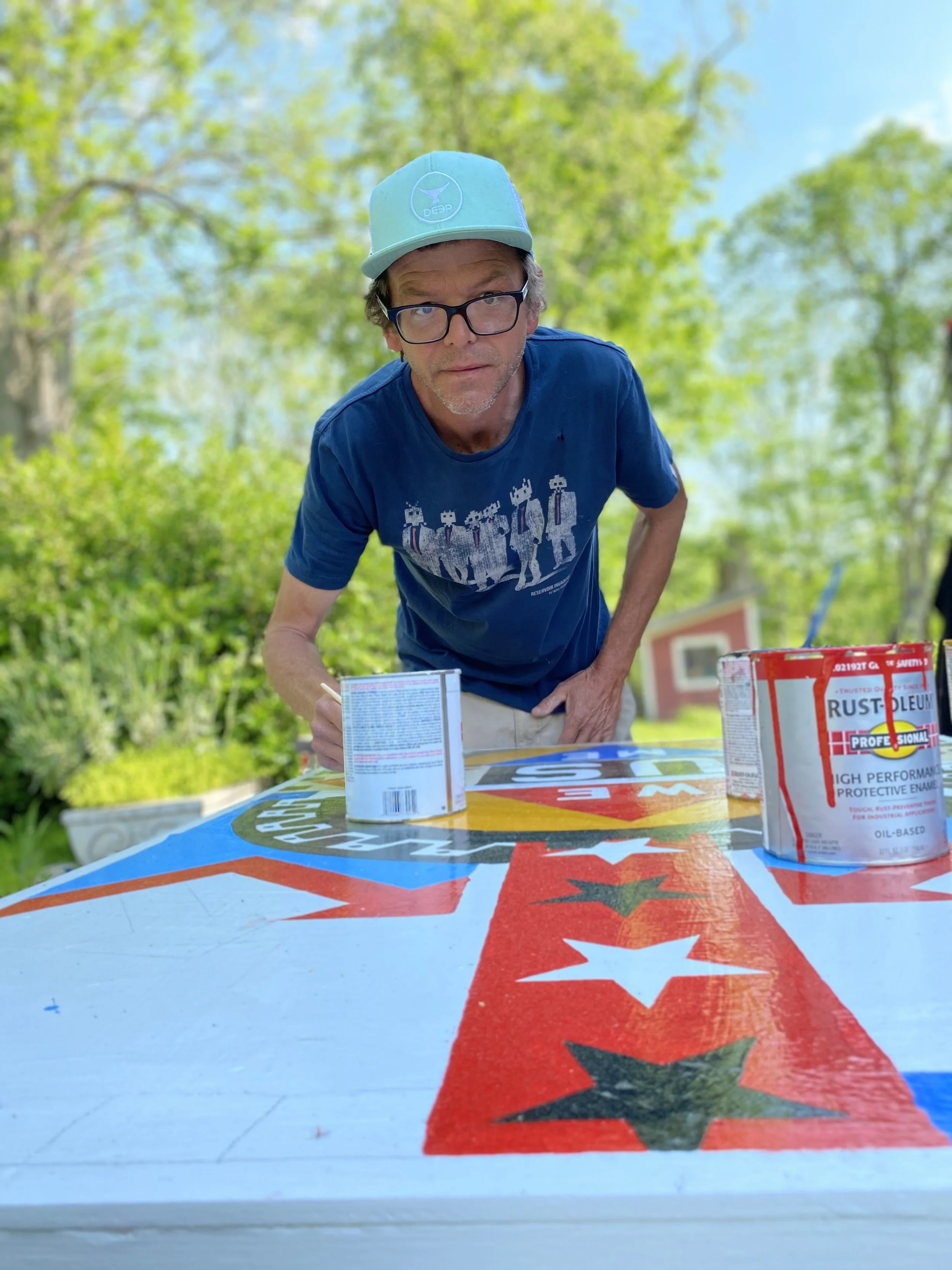
A Statement from Artist Ryan Cronin:
The DIY ethos of the 90s underground art scene ignited my creative passion and remains the foundation of my artistic practice. This influence has evolved into a focused study of color, composition, and placement in response to the world around me. I am, first and foremost, a painter, creating large-scale works mainly on board that allow for bold, immersive compositions with a physical presence.
My paintings are characterized by complex compositional structures achieved through the purposeful application of paint. The high-gloss finish lends an almost industrial quality, while visible brushwork and paint thickness reveal the human touch, creating an intriguing tension and depth. I use color with precision to evoke specific feelings and guide the viewer's experience, employing intentional markings to direct the eye across the board, much like text guides a reader through a book.
Creating art is an innate compulsion for me, an instinctive drive deeply rooted since childhood. I vividly remember exploring my father’s woodshop, scavenging scraps of wood and crafting boats and keychains - tangible objects born from the freely available materials around me. The act of transforming raw components into purposeful forms has been a lifelong pursuit, long before I even realized I was making art.
My practice has expanded beyond the studio to include public art installations and community-building initiatives. The Thread Artist Residency in Senegal broadened my perspective on how art can function in various contexts and cultures. This evolution has opened me to new ideas about activating artwork through audience experience and interaction. The work now extends beyond the piece itself and draws upon the audience as part of the act of creating art.
Whether in galleries or public spaces, my art aims to visually and intellectually engage viewers. I've come to understand the power of using my art as a vehicle to support principled projects and initiatives to effect positive change in the world. My approach now balances creating physical artwork with fostering connections and supporting meaningful initiatives.
My artistic practice is a synthesis of deliberate studio work and engaged public art, rooted in the DIY spirit but refined through years of focused study and experimentation. Through bold visual statements and thoughtful placement, I strive to create art that resonates with viewers, provokes thought, and contributes to broader conversations about our shared human experience.
Meet the artist.

Born on the front seat of a late 60's Plymouth Station Wagon, Cronin has kept his family, friends, and audience on their toes ever since. Ryan Cronin is a contemporary American artist whose vibrant oil paintings on board offer an unfiltered commentary on modern life. His work is characterized by bold use of color and precise compositional elements, dynamically exploring color, form, and cultural resonance.
Primarily focused on painting, Cronin's artistic practice also encompasses public art installations, sculptures, and drawings. His style is deeply rooted in the DIY ethos of the 1980s, which profoundly shaped his approach to his artistic practice. His unique artistic voice, developed across various mediums, has established Cronin in contemporary art. The breadth and consistency of his work contribute to his growing influence in the art world.
Cronin's work has been featured in solo and group exhibitions across the United States and internationally. Notable venues include Gallery Red in Mallorca, Spain, where his work hangs alongside Basquiat, Warhol, Hirst, Calder, etc, Lichtundfire Gallery in New York; The Dorsky Museum in New Paltz, NY; Katonah Museum of Art in Katonah, NY; and Yard Dog Gallery in Austin, TX. Since 2015, Cronin has maintained a permanent gallery and shop dedicated to his work in the Hudson Valley, NY. His artistic approach extends beyond traditional gallery spaces, with public art projects in New York City and Wynwood, Miami, FL. Cronin's work is held in corporate and private collections globally, further solidifying his international presence in the art world.
In 2019, Cronin participated in The Thread Artist Residency in Senegal through the Josef and Anni Albers Foundation, followed by a studio collaboration at Bankuba Art, Tambacounda, Senegal, with the artist Saliou Diop in 2023. In 2022, his painting, Obama Big Left, was selected for the permanent collection of the Obama Presidential Center in Chicago. Cronin received his BFA from the State University of New York at New Paltz. He lives and works with his family in New Paltz, NY.
“Creating art is an innate compulsion for me, an instinctive drive deeply rooted since childhood.”
— Ryan Cronin
All artwork is available for purchase. For inquiries on pricing or to experience in person, please contact us directly.
-
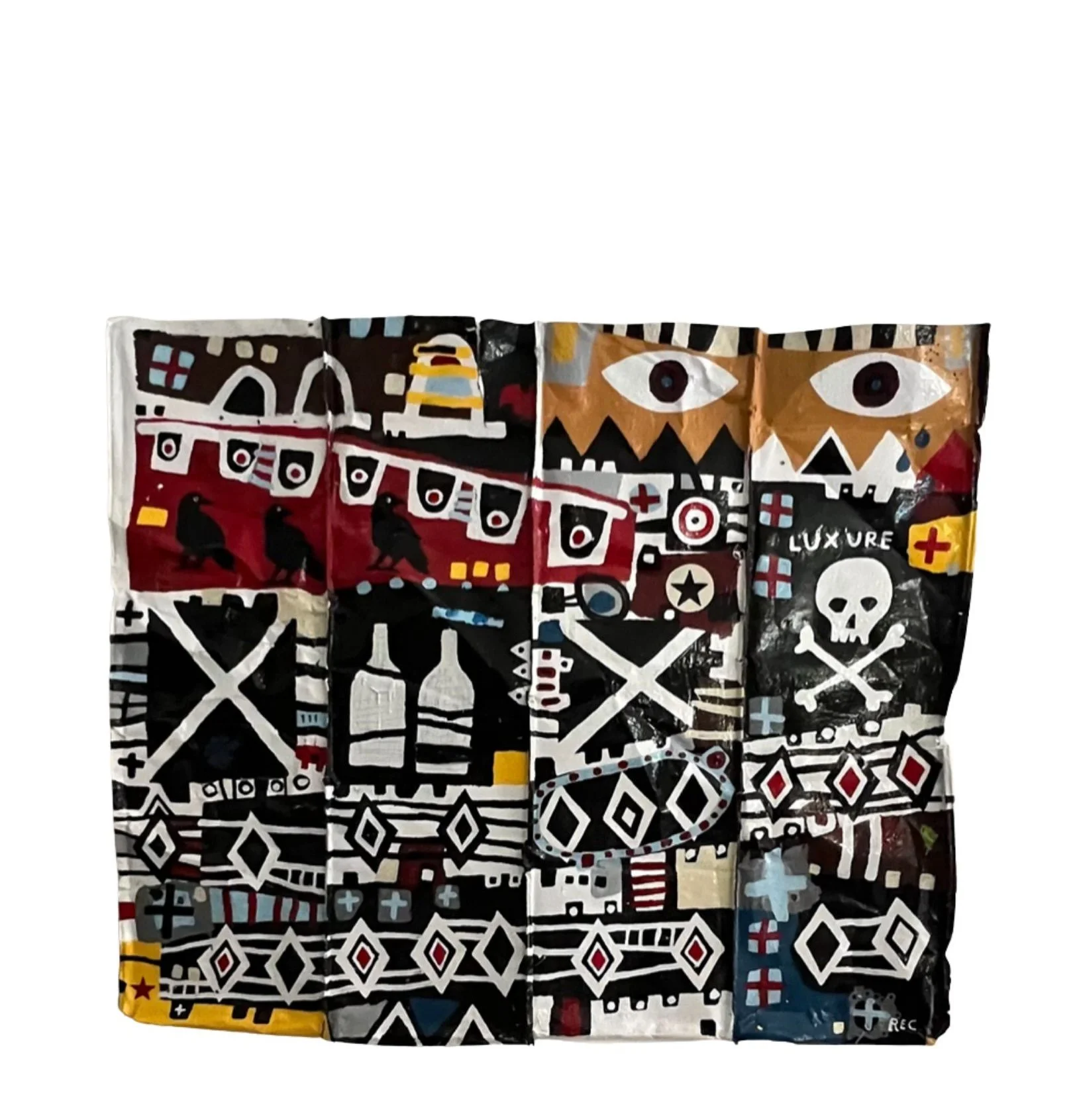
Oil Paint on 100+ Year Old Metal Roofing
60" x 60" -
Working on a century-old piece of metal roofing salvaged from his own home, Cronin creates a dense visual narrative that operates on multiple levels simultaneously. The substrate itself carries history—weathered metal that once provided shelter, now transformed into a surface for exploring themes of luxury, piracy, poison, and fresh air.
The composition erupts with Cronin's characteristic iconography rendered in bold black, white, red, and yellow against the metal's dark surface. Two prominent eyes peer out from the upper register, their geometric lashes creating a watchful presence. Below, a skull and crossbones—universal symbol of danger and piracy—anchors the lower section, while crossed X's (Cronin's signature motif) repeat throughout, creating visual rhythm and structural unity.
Text fragments appear across the surface: "LUXURE" embedded within the chaos, speaking to desire and excess. Bottle forms suggest both poison and libation. Geometric patterns—diamonds, zigzags, chevrons—create horizontal bands that organize the visual density while referencing traditional decorative motifs. The overall effect is simultaneously playful and ominous, decorative and dangerous.
Suspended above the main panel, a wooden assemblage of painted elements extends the composition into three-dimensional space. Striped patterns in red, yellow, black, and white create a rhythmic sequence, punctuated by Cronin's target motif and triangular forms. These wooden pieces—like the metal below—are elements salvaged from his home, materials that once served another purpose now appropriated into art.
This wall sculpture embodies Cronin's philosophy of transformation and acceptance of imperfection. Screwed directly to the wall, the metal shows its age—split and weathered—while the paint continues to evolve over time, cracking and shifting as the substrate responds to its environment. The work becomes a living thing, changing with the years. By painting on materials with their own stories—metal that weathered decades protecting a structure, wood that framed domestic space—he creates layers of meaning where past and present, shelter and art, utility and beauty intersect. The piece refuses permanence, embracing instead the inevitable transformation that comes with time.

-
This piece is available as a print; the original collage remains in the artist's personal collection.
Oil Paint on Board36" x 48"
Edition Number 25 of 100. -
In this collage work from his Thread residency, Cronin ventures into unfamiliar territory, pushing his practice beyond his signature painting style. Created in a standard art journal, the original shows evidence of its making—words bleeding through from hard-pressed penmanship, even the book's binder visible in the final documentation, adding unintended elements that became part of the piece.
The composition centers on a woven textile that Cronin crafted himself during afternoon walks around the village. He collected discarded paper, gathered rocks to create pigment colors, and wove the materials together, creating the orange-brown grid that dominates the left side of the work. Black vertical elements frame the composition, while a scrap of blue and white checkered fabric—found on the roadside, a piece of a discarded coal sack—occupies the upper right corner. Strategic placements of red punctuate the arrangement.
The text "MAN VS MACHINE" appears in hand-drawn letters across the lower register, making the work's central inquiry explicit. Below, Cronin's signature "X" motif—rendered in black with a white center—connects this experimental piece to his broader body of work.
Created during his month-long residency at Thread Artist Residency and Cultural Center in Senegal, thanks to the Josef and Anni Albers Foundation, this collage reflects Cronin's hands-on engagement with his surroundings. By weaving his own materials from found paper and rock pigments, he directly addresses the piece's title, blurring the line between handcraft and artistic production. The work captures a specific moment of creative exploration, documenting both the artist's process and the materials of a particular place and time.
This piece is available as a print; the original collage remains in the artist's personal collection.

-
The works displayed are Artist's Proofs. Fresh prints created upon purchase.
Artist's Proofs on View: 60" × 75" prints on Hahnemühle paper
Edition of 5 Original Drawings: 22.5" × 30" on Stonehenge Paper. -
The works displayed are Artist's Proofs. Fresh prints created upon purchase.
In this series of oil pastel works, Ryan Cronin reveals the meditative rhythm of his artistic practice through what he calls "slow accumulation." Working on Stonehenge paper, he builds compositions over days or weeks, beginning at a single point and allowing each piece to expand organically across the surface.
These drawings represent a distinctive counterpoint to Cronin's large-scale paintings. While his paintings feature high-gloss finishes and carefully structured compositions, these pastels embrace a more tactile quality where the physical act of drawing—the pastel against paper, the buildup and smudging of pigment—becomes as integral as the resulting composition itself.
Color relationships drive these works, with Cronin deliberately juxtaposing contrasting hues to create visual tension. The interplay between defined geometric shapes and fluid gestures reflects his fascination with how different visual elements interact within confined space, functioning as visual cartography that charts both physical and emotional territories.
This collection comprises seven drawings. Complete series, pricing, and availability of both original works and prints available.

-
Oil Paint on Board
48" x 48" -
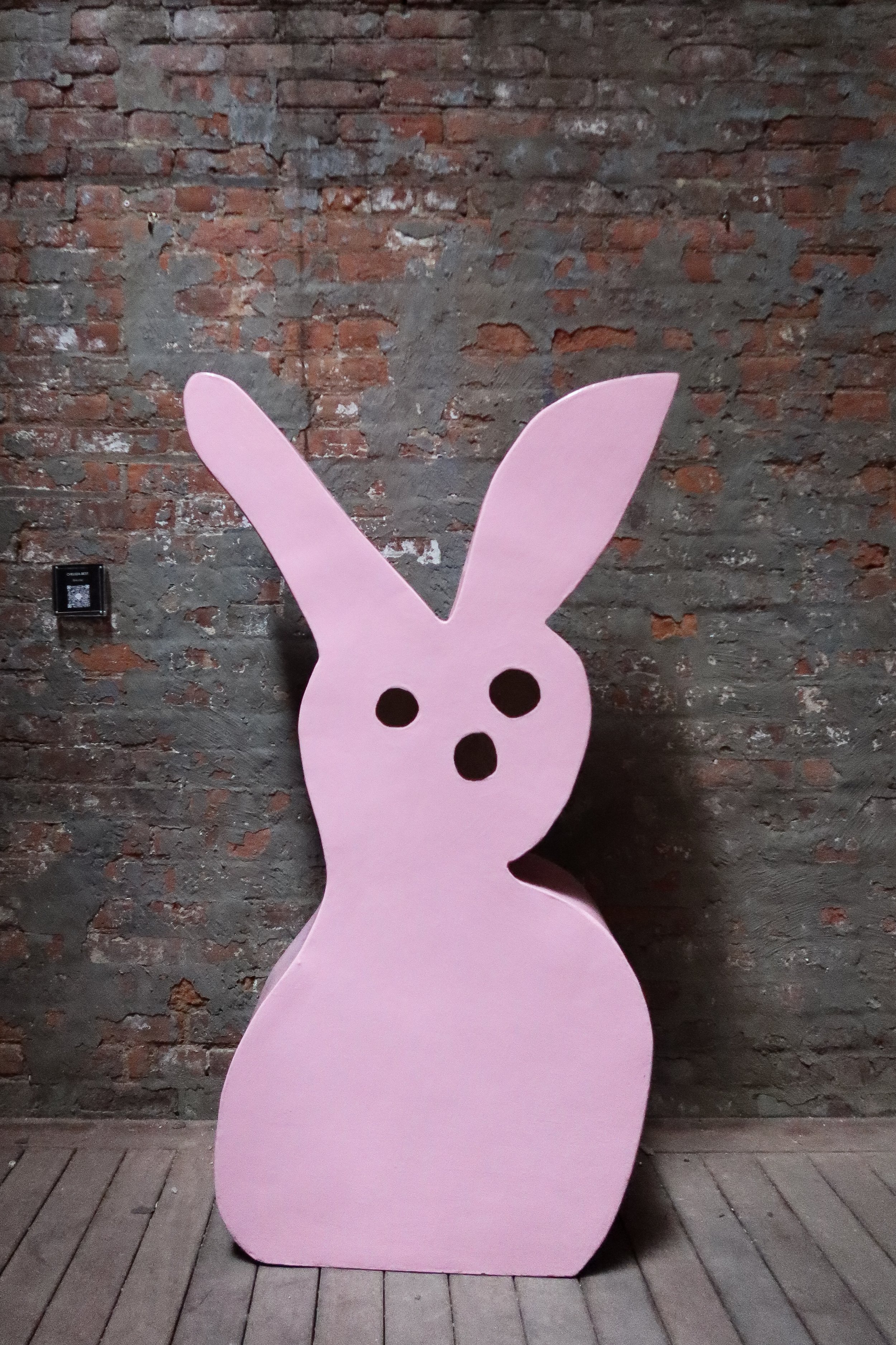
In 2011, Cronin's 20-foot inflatable bunny balloon floated through the skies of Miami during Art Basel, catching the attention of thousands—including mindfulness teacher and activist Shelly Tygielski. Nine years later, they connected through a mutual friend on social media, sparking a conversation that would lead to genuine friendship and collaboration.
When Shelly approached Cronin to create a piece in response to her book "Sit Down To Rise Up," the connection made sense immediately. Both were focused on using their platforms for collective good, on supporting their communities through action rather than just words. Shelly's message—that self-care and healing make way for collective action and social change—resonated with Cronin's own approach to art and life. As they began working together, Shelly mentioned she'd seen his bunny balloon years earlier in Miami—a memory that came flooding back, connecting their past to their present collaboration.
The painting moves through three distinct zones, each marking a stage in the journey from individual awareness to community transformation. The upper section bursts with geometric energy—checkerboard patterns, chevrons, striped circles, and a red vertical band studded with white stars. At the heart, a golden wheel—purposefully misshapen rather than a perfect circle, its gears visible—frames the central message: an eye above the letters "WE" enclosed in a red triangle, suggesting collective awareness and shared vision. Below, "US" commands the center in bold black letters, flanked by red chevrons that draw the eye inward. The lower register mirrors this structure, with "ME" nestled in a blue diamond, the imperfect wheel completing its arc.
Cronin translates Shelly's philosophy into his characteristic visual language—stars, eyes, chevrons, stripes—creating a composition that refuses to separate the personal from the collective, showing how one naturally flows into the other. The symmetry demonstrates the relationship: individual self-care supporting collective action, personal healing enabling social change. The deliberately imperfect wheel acknowledges that transformation isn't smooth or perfectly circular—it moves forward through effort and imperfection.
The collaboration extended beyond the painting itself into a line of merchandise, making the work accessible beyond gallery walls. What began with a bunny balloon in Miami and reconnected through a chance social media encounter became something neither expected—a working partnership that demonstrates what happens when artists and activists recognize they're after the same thing.
-
Oil Paint on Board
36" x 40" -
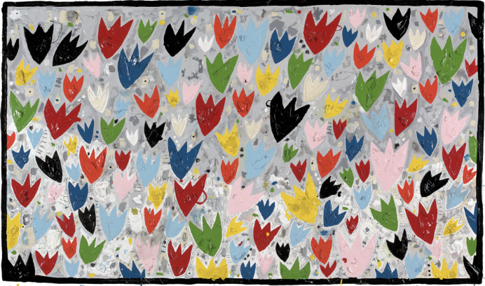
Commissioned by Mohonk Mountain House in late fall 2019 for their first annual tulip festival in 2020, this piece marked a period of creative experimentation for Cronin. Fresh from his month-long residency at Thread Artist Residency and Cultural Center in Senegal through the Josef and Anni Albers Foundation, he returned home eager to push his practice in new directions.
The composition celebrates the profusion of Mohonk's Victorian gardens—a riot of tulips in red, blue, green, yellow, pink, and black against a silvery-grey ground. Cronin's approach to creating this joyful scene emerged from something that had been happening in his studio for years. He always left his paint cans open, and over time thick layers would form—dried paint skins that piled up around him. For this piece, he cut these layers out and gave them new life as texture.
He built up the tulips using these salvaged paint skins, creating actual dimensional petals that cast subtle shadows and catch light differently than flat paint. Working with the back of his brush and pencil, he scratched details and marks into the surface, adding linear elements that dance between the blooms. The result is a painting that operates on multiple levels—from a distance, a cheerful field of spring flowers; up close, a complex surface of built-up materials and incised marks.
The grey background shows evidence of his process—drips, splatters, and gestural marks that suggest the energy of creation. Each tulip maintains Cronin's characteristic simplified form—three pointed petals reaching upward—but the repetition creates movement across the entire surface, like wind moving through the gardens.
Created to honor Mohonk's historic landscape and celebrate the return of spring, the piece also documents a specific moment in Cronin's evolution as an artist—when he decided to transform accumulated paint skins into something essential to the work itself.
-
Oil Paint on Board
48" x 48" -
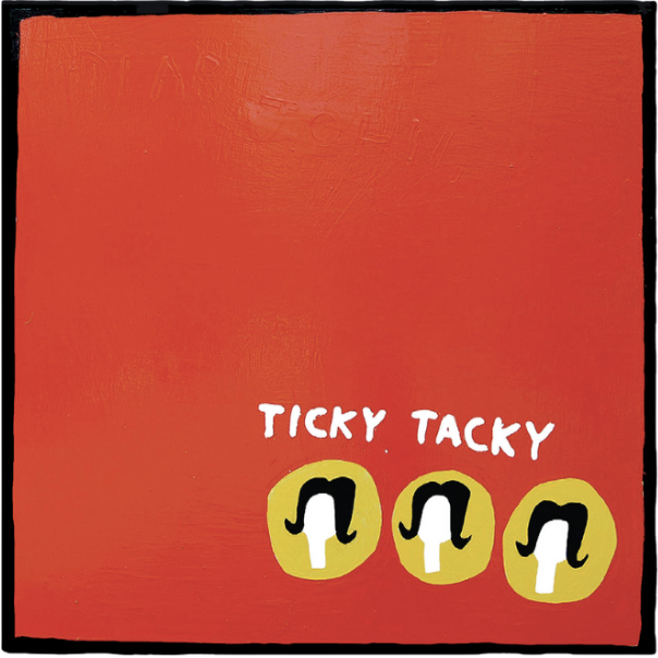
Against a vibrant orange field, Cronin presents a deceptively simple composition that examines mid-century suburban conformity. The work's title appears in two places with deliberate contrast—"TICKY TACKY" boldly proclaimed in white lettering at the bottom, while "DEAR JOHN" emerges subtly from the orange background in matching paint, built up in layers that only reveal themselves when caught in the right light.
Three identical yellow circles containing stylized female profiles anchor the lower portion of the composition. Each figure bears the characteristic bouffant flip of 1960s suburbia—black hair with white faces rendered in Cronin's signature graphic style. The repetition transforms individual identity into mass-produced uniformity, echoing the "cookie cutter" sameness referenced in the title.
Working in oil on board, Cronin builds up the surface with his characteristic attention to texture and depth. The orange field appears flat from a distance but reveals complexity up close—brushstrokes, variations in tone, the hidden text that emerges only when light hits it right.
The piece layers its meanings deliberately. "Ticky tacky" refers to the cheap materials used in 1960s tract housing developments—the same mass-produced sameness that defined both the homes and the lives within them. "Cookie cutters" suggests both kitchen tools and standardized existence. Cronin creates work that's immediately engaging while carrying deeper resonance about conformity and the desire to break free from it.

-
Oil Paint on Board
42" x 42" -
Created in summer 2025, this piece captures a fleeting moment—the glimpse of a storefront window as you pass by, that brief encounter with something alive and vibrant, knowing its beauty is temporary.
The composition arranges tulips in horizontal bands, like shelves in a shop display. Simplified three-petaled forms appear in red, blue, yellow, cream, brown, and lime green. Bold color blocks—red, golden yellow, deep blue, and pale blue—create the structure, separated by grey dividers. Black and white checkered patterns frame the top and bottom, adding graphic rhythm.
Cronin returns to the tulip motif he first explored for Mohonk Mountain House, but this time the approach is different. Where the earlier piece celebrated profusion and spring renewal, this work contemplates the moment of passing by. The piece also marks a shift in process—during this period, Cronin has been filling boards with heavy mark-making and dense paint application. Here, he pulls back, exercising restraint. The composition breathes, demonstrating his understanding of when to stop, when less conveys more.
The storefront structure creates distance between viewer and subject. We're outside looking in, observing these arranged blooms through glass, passing by on our way to somewhere else. The horizontal bands suggest shelves or rows, the organized display of a shop window. Yet there's warmth in Cronin's color choices—the rich yellows and reds, the varying blues—that elevates the simple storefront glimpse into something worth pausing for.
Working in his characteristic style, Cronin uses bold color fields and simplified forms to capture a specific moment in time—that split second when something catches your eye as you walk past, beautiful and alive, even if only briefly.

-
Oil Paint on Board
42" x 48" -
In this playful exploration of identity and leadership, Cronin presents a headless torso against a soft grey background – a deliberate absence that redirects all attention to what matters most. A crisp light blue shirt meets a cheerful polka-dotted tie in red, yellow, black, and blue, while a bold red heart sits in the breast pocket precisely where the physical heart would beat beneath.
The composition's power lies in what Cronin chooses to omit. By removing the face – traditionally the seat of identity and recognition – he creates a universal figure that speaks to a broader truth about authentic leadership and human connection. The heart becomes the focal point, both literally and metaphorically, framed within its shield-like pocket as if protected and honored.
Working in his characteristic graphic style, Cronin employs smooth, confident linework and flat planes of color to create an approachable simplicity that carries surprising depth. The soothing blue shirt provides a calm foundation, while the playful spotted tie cascades down the center like a celebration of individuality within professional formality. The red heart glows warmly against the pale blue fabric, creating an unmistakable focal point.
As Eric Gullickson, President of Mohonk Mountain House, observed, the work serves as a powerful reminder to lead from the heart. By eliminating the head, Cronin suggests that true leadership – and perhaps true self-portraiture – resides not in the mind's calculations but in the heart's authentic impulses. The piece balances humor with sincerity, transforming corporate iconography into something more human and vulnerable.
-
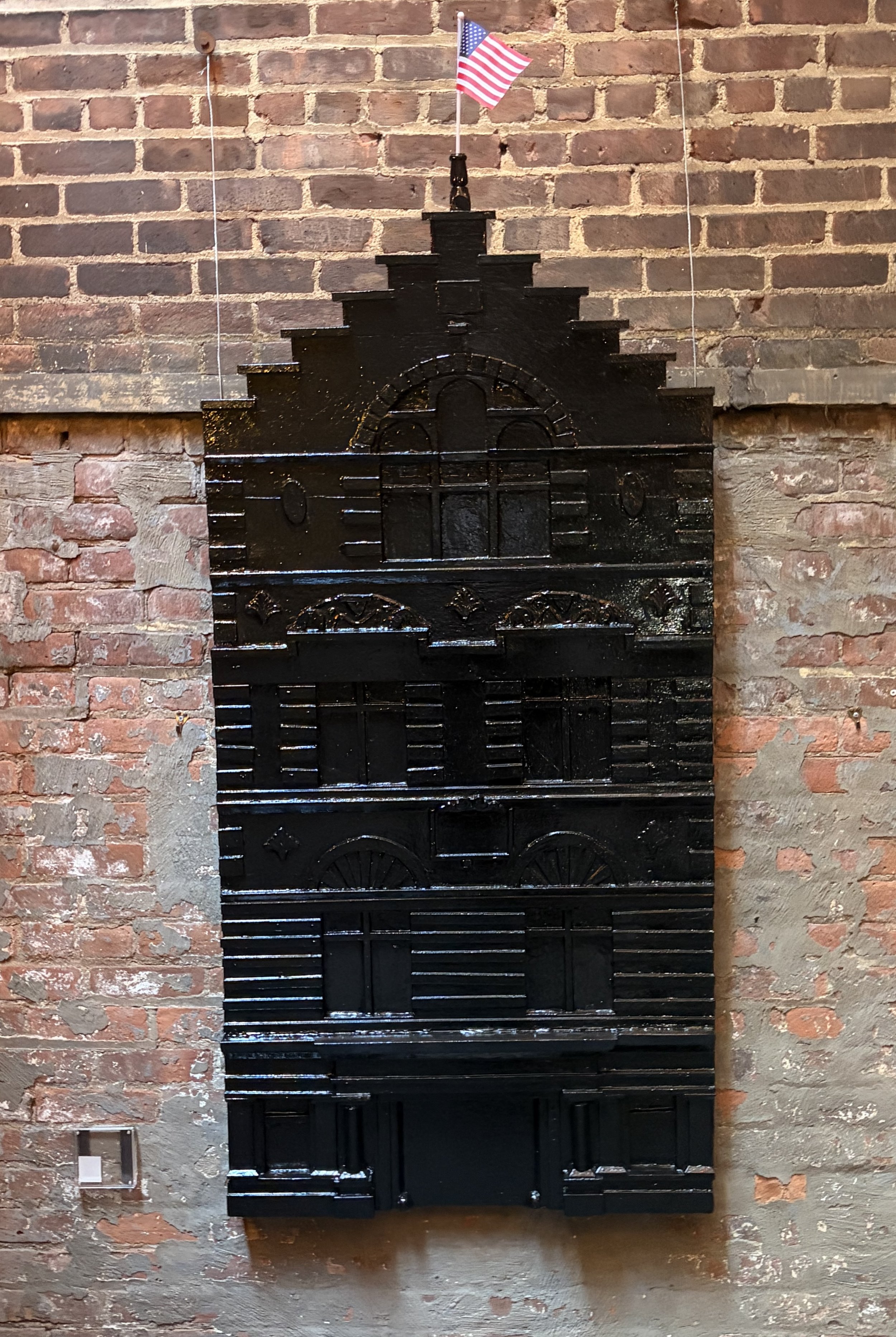
Wall Sculpture
Wood and PL Glue -
Created specifically to honor the heritage of the historic Two Forty Thirty building, this wall sculpture emerged from Cronin's exploration of the actual structure and its history. Drawn to the building's architecture, he researched its past and set out to create a piece that would serve as a proper tribute.
The piece recreates the building's distinctive stepped gable facade in exacting detail. Working primarily in wood, Cronin built out the surface layer by layer, replicating the horizontal banding and architectural elements that define the structure. He added architectural details with PL glue, capturing the craftsmanship and ornamental character of the original building.
The result is a three-dimensional translation of the facade, complete with the characteristic stepped roofline, multiple tiers of windows and architectural details, and the textural quality of aged materials. The dark finish echoes the building's weathered appearance, preserving a moment in time.
This sculpture exists at the intersection of art and architectural preservation. Where Cronin typically works in bold iconography and social commentary, here he creates something different—a dimensional portrait of a place, translating stone and brick into wood and sculptural form. It's both homage and original creation, demonstrating his range beyond the painted surface.
-
Oil Paint on Board
36" x 36" -
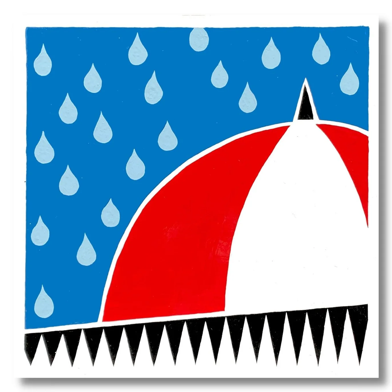
Cronin tightens the contrast on purpose. The form holds firm against a near-black ground, the palette stripped to the essentials. Across the series, he held one subject steady and let everything else move. When It Rains It Pours IV is one of the boldest restraints. Less color. More weight. The kind of decisiveness that only comes from staying inside the work.
-
52” x 29” x 12.5”